Directional Signs - Sign Face Layout Design Guidelines
Table of Contents
1. Introduction
The design of a direction sign face is important to ensure the sign is clearly visible and legible to enable a driver to read and understand the sign sufficiently in advance of the location at which a decision must be made and a driving manoeuvre performed. The legibility of a sign is predominantly governed by the letter size and type but there are various other elements and factors in the design of a sign face that can influence its legibility.
AS 1742.15-2007 Manual of Uniform Traffic Devices, Part 15: Direction signs, Information Signs and Route Numbering and AS 1743-2001 Road Signs - Specifications were prepared by the Standards Australia Committee on Road Signs and Traffic Signals to provide national uniformity in the use of direction signs. The standards provide guidance at a high level and allow each road authority some flexibility to specify their own requirements.
The purpose of these guidelines is to supplement AS 1742.15 and Sections 5 to 8 of AS 1743 by providing detailed design information that is applicable to direction signs in the West Australian context. This will enable practitioners to design direction signs without necessarily resorting to use of the MRWA SIGNS computer program. Where there is inconsistency between these guidelines and the Australian Standards, these guidelines shall take precedence.
2. Colour and Reflectorization
Direction signs on all roads, including freeways, have a white reflectorized legend on a reflectorized standard green background. Route name panels required within or in conjunction with the sign have a black legend on a white reflectorized background. Inlay panels containing driving instructions with legends such as "ONLY" or "EXIT ONLY", associated with directions to indicate a trap lane situation, shall be black on a yellow background. The class of retroreflective material to be used on signs is shown in Table 3 of the Sign Standards Guidelines.
The backs of the sign panels are to be of neutral appearance and should not be light coloured, glossy or polished. In areas within the Green Zone (defined in Drawing No. 9448-0144), the backs of the signs are to be painted in matt Bottle Green - G11 (previously referred to as Brunswick Green).
3. Legend Elements
3.1 Letter Types and Sizes
3.1.1 Destinations
The letters for destinations on direction signs are in lower case Mod E letters with initial capital letters.
Typical letter sizes for non-freeway signs are given in Table 3.1 and for freeways and grade separated interchanges in Table 3.2. These tables replace Table 1.2 in AS 1742.15.
The letter sizes in Table 3.2 are a guide only and may in certain situations have to be increased to improve conspicuity or decreased to fit in the space available for the sign. Some typical examples of where letter size may need to be increased are where:
there is excessive visual clutter around the proposed location of the sign (eg. near advertising billboards, complex or high density buildings in the background);
the sign is overhead mounted or if it is side mounted with an unusually large offset from the traffic lane;
it is not possible to position the sign sufficiently far in advance of the intersection or route change; or
the sign is composed of short legend and the visual appearance of the sign looks odd.
|
Road
|
Letter Size Mod E (mm)
|
||
| Advance Direction |
Intersection Direction |
Reassurance Direction |
|
|
Expressway with at-grade intersections
|
320
|
200
|
240
|
|
Major Road other than a Freeway or Expressway
(> 70km/h speed limit)
|
240
180/2002 for MR-GE-29 (G1-5) |
200
|
200
|
|
Minor Road (two-lane, < 60km/h speed limit)
|
200
160/1802 for MR-GE-29 (G1-5) |
160/2001
|
-
|
|
Overhead Signs
|
320
|
320
|
-
|
- The selection of 160 mm or 200 mm letter size depends upon sign conspicuity.
- The choice of letter size for a particular speed would depend on the number of lanes on the approach to the roundabout and the space available for the sign
TABLE 3.1: Letter Sizes for Destinations
- Non-freeway Signs
|
||||||||||||||||||||
TABLE 3.2: Letter Sizes for Destinations
- Freeways and Grade Separated Interchanges
3.1.2 Route Names and Driving Instructions
Series EM letters are preferred for route names and Series EW letters for driving instructions (such as EXIT or LEFT LANE). Series DM or DN letters may be considered if the route name or driving instruction is controlling the width of the sign.
The letter sizes given in Table 3.3 are approximately the same height as the lower case of the destination legend. For the route name, there is scope to reduce the letter size if the route name is very long and would be better accommodated using two lines of text.
Destination Mod E (mm) Route Name (Series EM preferred)1 (mm) Driving Instruction (Series EW preferred)1 (mm) 160
200
240
320
400140
160 or 180 (or 140)2
200 (or 160)2
240 (or 200)2
320 (or 240)2140
160 or 180
200
240
320
1. Series DM or DN letters may be considered if the route name or driving instruction is controlling the width of the sign
Where numerals are followed by a quantity unit, such as "5 t" or "500 m", the unit is to be in Mod E lower case. The Mod E letter height (specified as the capital letter height) for the quantity unit is approximately 0.85 times the numeral letter height.
3.1.3 Advance Street Name Signs
Street name plates for advance street name signs shall consist of an extruded aluminium section, either 150mm or 210mm deep, depending on the posted speed limit.
Street name signs for crossroads shall have square ends. The Main Roads sign type for this is the MR-GS-4 sign. Street name signs for side road junctions shall be square on one end and pointed at the junction side end. The Main Roads sign type for this is the MR-GS-3 sign. In both cases Type DM letters are preferred, but Types DN, CM or CN (in decreasing order of preference) may be used for long road names. The maximum sign width shall be 1200mm.
Abbreviations for road types, eg. "AV" for "Avenue", are given in the StreetSmartImage: Copy Right.RCN-D14^2322577.GIF and UBD directories for the City of Perth.
Design details for advance street name signs are given in table 3.4.
| Posted Speed Limit (km/h) | Sign Type | Extrusion Depth (mm) | Letter Size (mm) |
| > 80 km/h | MR-GS-3A, MR-GS-4A |
150 | 100 |
| <90 km/h | MR-GS-3B, MR-GS-4B |
210 | 120 |
3.2 Route Name Inlays and Route Name Plates
Route name inlays embedded on the main sign panel have the spacing around the legend and panel depths in accordance with Table 3.5. The corners are square.
Where the route name is accommodated on two lines of text, the depth of the route name inlay will be the same as the height of the route marker. (The route marker height is double the height of the destination letter size).
| Route Name Letter Height |
Route Name on one line | Route Name on two lines | |||||
|
Vertical and Horizontal Spacing from edge of panel
|
Panel Depth
|
Vertical and Horizontal Spacing from edge of panel
|
Spacing between lines
|
Panel Depth1
|
|||
|
140
|
45 |
230
|
25
|
70
|
400
|
||
|
160
|
55 |
270
|
40
|
80
|
480
|
||
|
200
|
65 |
330
|
70
|
100
|
640
|
||
|
240
|
80 |
400
|
100
|
120
|
800
|
||
|
320
|
105 |
530
|
NA
|
NA
|
NA
|
||
1. The panel depth is the same as the height of the Route Marker
|
||||||||||||||||||||||||||||||||||||||||||||||||||||||||
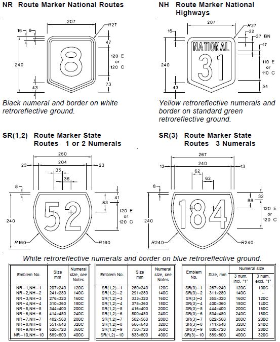
3.3 Route Markers
Where applicable, route markers are placed in the main sign panel of direction signs. The centre of the route marker is to be aligned with the centre of the destination or route name inlay.
The size of the route marker is generally selected so that the height of the route marker numeral is the same as the principal letter height of the sign legend. An exception is for cross roads on interchange sequence signs where the numeral size of the route marker is one size smaller to reduce the space between the lines.
Free-standing route markers are only used for advance or reassurance direction purposes where the corresponding direction signs have not been installed.
For emblems with one numeral only, use Series E and position numerals within shield for optimum visual balance.
Select emblem size so that numeral height is equal to 1.0 (desirable) or 0.75 (minimum) times capital letter height of the main sign legend.
3.4 Arrows
|
Direction arrows are those used in the MRWA SIGNS program and have the dimensions shown in Table 3.7. The application of the arrow types and alignment with the sign legend is illustrated in Figure 3.1.
TABLE 3.7: Arrow Types and Dimensions
The orientation of the arrow is specified in degrees in accordance with Figure 3.2. A modified S arrow is used on the main route at staggered T intersections and closely spaced intersections such as at diamond interchanges. The modified S arrow has the same arrow height and width as for the S arrow but the arrow shaft is bent at 90 degrees and has a uniform width. 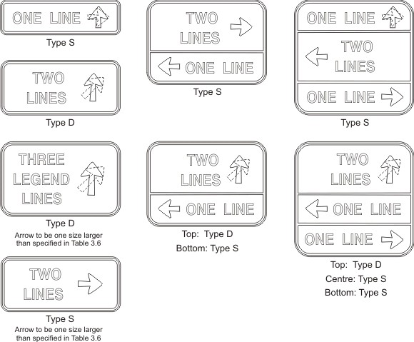 FIGURE 3.1: Application of Direction Arrows
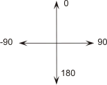 FIGURE 3.2: Arrow Orientation
|
|||||||||||||||||||||||||||||||||||||||||||||||||||||||||||||||||||||||||||||||
3.5 Chevrons
Chevrons are used in Intersection Direction signs (G2-1). The standard angle of the pointed end of the chevron is 52o, as measured from the horizontal.
The width (or thickness) of the chevron is the same as the major letter height of the sign. The height of the chevron is dictated by the height of the sign panel, the Border (B) and the Edge Strip (ES), as illustrated in Figures 3.3 and 4.1.
3.6 Borders
The border width, edge strip width and divider width are illustrated in Figure 3.3 and are determined using the formulae below.
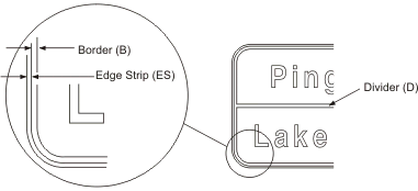
FIGURE 3.3: BORDER DETAILS
Border width B = 0.15 x H where H = letter height of principal legend
Edge strip width ES = 0.1 x H
Divider width D = B
3.7 Corners
The corner radii of main sign panels are determined using the following formula:R = 0.125 x HP (rounded up to nearest 25mm) + 25mm
Where
R = corner radius
HP = panel height or panel width (whichever is smaller)
*Note: Maximum corner radii to be 300mm
4. Spacing of Legend Elements
4.1 Vertical Spacing
The vertical spacing between legend elements should be in accordance with Figure 4.1. There may be some minor variation of the spacing if the panel height is adjusted to suit the standard aluminium sheet sizes - refer to Section 5.4.2 Horizontal Spacing
The horizontal spacing between legend elements (other than between letters and numerals) on the longest line of legend on the sign is typically 0.75H (where H is the letter height of the principal legend). However, the horizontal spacing can vary between 0.65H to 1.0H, depending on the balance of the sign and the rounding of the panel width.The spacing between letters is given in AS 1744. For reassurance directions signs and interchange sequence signs, the separation between the destination and the distance is a minimum of 1.5H to clearly separate the two items.
For chevron-ended signs, the spacing between the border and the chevron is equal to the sum of the border and the edge width.
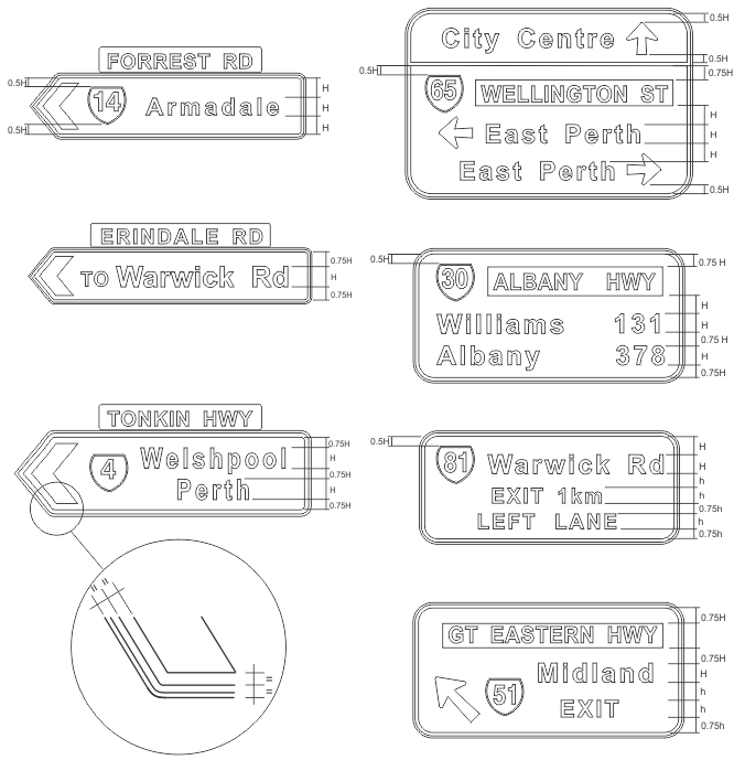
FIGURE 4.1: Vertical Spacing Between Sign Legend Elements
5. Sign Panel Dimensions
The design of direction signs should consider the standard aluminium sheet sizes to minimise the amount of cutting required.The standard sheet sizes for aluminium blanks are:
- Width 2400mm and 3600 mm.
- Height 450 mm, 600 mm, 750 mm, 900 mm and 1200 mm
After the sign has been designed in accordance with the spacings recommended in Section 4, the height of the sign panel can be increased or reduced by up to 4% without affecting the appearance of the sign. Slightly more variation in the width of the sign panel may be possible.
6. Fingerboards
Fingerboards are occasionally used in rural situations at minor intersections as intersection direction signs, where chevron-ended signs (G2-1 or G2-4) are not warranted. These signs are used to show the destination (usually a town name) and the distance to the destination.Fingerboards shall consist of an extruded aluminium section, 210mm deep, as shown in drawing no. 8720-0167. Series 120 DN letters shall be used for the destination name and Series 100 DN numerals shall be used for the distance to the destination.
The Main Roads sign type for a single-ended fingerboard is the MR-GFB-1 sign. The maximum length of this sign shall be 1800mm. It should be noted that the destination and distance information put on this sign is usually applied to both sides.
The Main Roads sign type for a double-ended fingerboard is the MR-GFB-2 sign. The maximum length of this sign shall be 3400mm.
